Pedro Bianchi
Client
Pedro Bianchi
Year
2026
Pedro Bianchi is a public management consultant, researcher, and leadership educator with over a decade of experience. The website existed, but it didn't clearly communicate who he is, what he does, or why someone should hire him. The project started with a deep dive into the existing site to understand its structure before proposing any changes.
Scope of work

01. Research & Strategy
The starting point was a full audit of the existing website: every section of every page was mapped, content inconsistencies were identified, and the site's strategic role was evaluated as a whole.
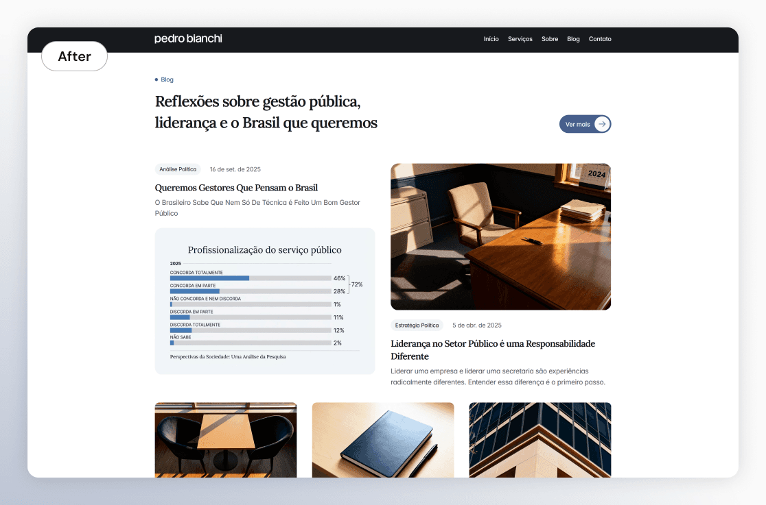
The diagnosis revealed serious usability issues. Service cards on the home page didn't link to the service pages, creating a dead end for anyone who wanted to learn more. Blog images appeared cropped, with no title or description. The contact form wasn't working. And all services were grouped on a single page, creating unnecessary cognitive load for the user.
Beyond the technical issues, there was a larger strategic gap: the site had all the information needed to convince a potential client, but never brought it together to directly answer the most important question for a first-time visitor. That's how the "Why Pedro?" section came to be identified as the most critical contribution to conversion.

02. Ideation & Design
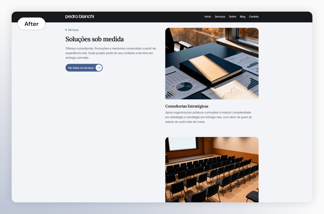
With the audit complete, I proposed a new information architecture with five main pages: Home, About, Services, Blog, and Contact, plus individual pages per service and blog post. The service pages were structured as a CMS with standardized sections — hero, who it's for, areas of focus, and how it works — ensuring consistency without losing personalization.
The biggest design challenge was creating a visual identity that communicated authority to an institutional audience without losing Pedro's human and accessible voice. The existing primary color wasn't aligned with that positioning, so I defined a new palette with slate blue as the main color, approved with WCAG AA contrast. The gray scale was built from scratch with a cool blue bias, reinforcing the identity's coherence.
For typography, I recommended pairing a serif font for headings to reinforce Pedro's academic voice, with Inter for body text for readability and modernity.
03. Testing & Iteration
I conducted periodic reviews of the site throughout development, identifying bugs, copy inconsistencies, unreplaced placeholders, and opportunities to improve performance, accessibility, and SEO, including an analysis of the PageSpeed Insights report. Each review round produced specific fixes that were applied before delivery to the client.

04. Final Solution
The delivered site has a cohesive visual identity, clear information architecture, and strategic copy written from scratch in first person, with a focus on conversion. Each service has its own page, eliminating the cognitive overload of the previous model.
The main takeaway was about the role of visual identity in communicating authority. Color, typography, and hierarchy are not aesthetic decisions. They are strategic decisions that define how a client is perceived before the user reads a single word.